My Inspiration for a Chart class came from the trendet Python package
My inspiration from the trendet Python package is to create a general method for a ChartCls class, that conveniently draws a span of vertical lines to highlight up and down trends on a given chart.
Read to the end of article for the SPOILER.
What is trendet?
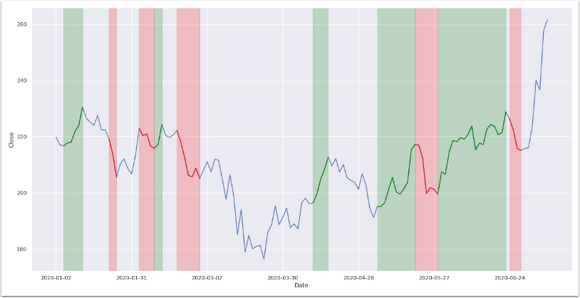
The trendet Python package comes with an easy trend detection tool. It conveniently plots a chart that highlights both the uptrend regions and downtrend regions, in green color and red color, respectively.

Prerequisites
- trendet - Python package to detect trends
- matplotlib - Python package to plot charts
- seaborn - Python package to plot lines
Step 1 - Understand the trendet code sample
trendet is a Python package to automatically detect trends for any given time series data, e.g. S&P 500. This package has been created to support investpy features when it comes to data retrieval.
The full sample code can be found here.
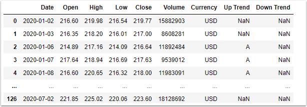
The identify_all_trends() function returns a DataFrame consisting of a time series data for a given symbol.
 df = trendet.identify_all_trends(stock='baba',
                                  country='united states',
                                  from_date='01/01/2020',
                                  to_date='09/07/2020',
                                  window_size=5,
                                  identify='both')
In addition to the OHLC columns, the function returns two columns, i.e. “Up Trend” and “Down Trend", both of type string.
For example, the “Up Trend” column consists of either NaN or string values, such as “A”, “B”, “C”, etc. Rows that have the same values, e.g. “A”, belong to the same group.
Both the “Up Trend” and “Down Trend” columns can consists of multiple groups, where each group consists of the same consecutive value, e.g. “AAAA”.
Step 2 - Preparing the data for a chart
The matplotlib Python package contains a function axvspan() that draws a span of vertical lines for a range of index, which is typically Date, on the x-axis.
The object ax is of type axes, which is a return object from matplotlib, when you create a figure.
The for loop gets each unique label from labels, and passes the first argument to axvspan().
df[df['Up Trend'] == label].index[0]
The first part before the dot (.) is a subset of the DataFrame, where “Up Trend” equals label, while the second part after the dot, index[0], returns the Date of the first row of the subset.
The second argument to axvspan() is similar to the first argument.
df[df['Up Trend'] == label].index[-1]
The second part after the dot, index[-1], returns the Date of the last row of the subset.
The third and fourth parameters of the function axvspan() are straightforward, alpha of type float is the opacity (0-1), while color of type string is self-explanatory.
The variable labels is assigned to a list of unique objects in column “Up Trend", e.g. [‘A’, ‘B’, ‘C’, ‘D’, ‘E’]
 labels = df['Up Trend'].dropna().unique().tolist()
 for label in labels:
     sns.lineplot(...)
     ax.axvspan(df[df['Up Trend'] == label].index[0],
                df[df['Up Trend'] == label].index[-1],
                alpha=0.2,
                color='green')
After loop completes for “Up Trend” column, we perform the same function for “Down Trend column.
 labels = df['Down Trend'].dropna().unique().tolist()
 for label in labels:
     sns.lineplot(...)
     ax.axvspan(df[df['Down Trend'] == label].index[0],
                df[df['Down Trend'] == label].index[-1],
                alpha=0.2,
                color='red')
Step 3 - Create method for a ChartCls
We want to create a general method MainAddSpan(), for a ChartCls class, as part of a larger collection of methods for plotting time series data on a chart.
You can read the article Object-oriented programming for data scientists to learn more about Python classes.
We can then conveniently draw a span of vertical lines to highlight up and down trends on a given chart.
This method MainAddSpan() takes four arguments, dfTag, lstTag, dblOpacity, strColor.
- dfTag is a DataFrame that consists of tags in a time series format, i.e. index is of type Date
- lstTag is a list of unique tags
- dblOpacity is a double for alpha between 0.0 and 1.0 (Default='0.2’)
- strColor is a string for color (Default='green’)
This method does not have a return value, however it draws a span of vertical lines to the chart object of the ChartCls class.
     def MainAddSpan(self, dfTag, lstTag, dblOpacity=0.2, strColor='green'):
         df = dfTag
         axs = self._axsMAIN
         for s in (lstTag):
             axs.axvspan(dates.date2num(dfTag[dfTag==s].index[0]), dates.date2num(dfTag[dfTag==s].index[-1]), alpha=dblOpacity, color=strColor)
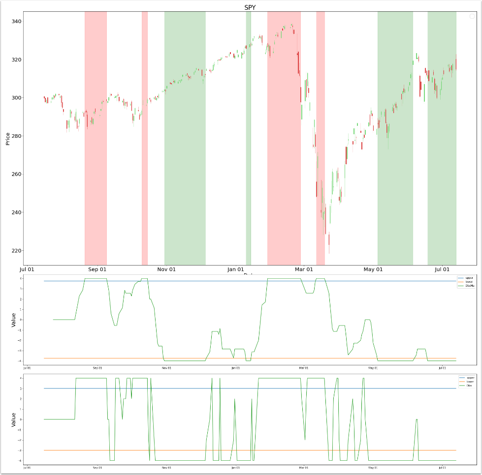
In this example, I create an object ChartCls, and call the method MainAddSpan().
 #
 # create ChartCls instance
 chart = ChartCls(test._dfDbs, intSub=2)
 #
 # build indicator
 chart.BuildOscillator(1, test._dfDbs['Dbs'], intUpper=3, intLower=-3, strTitle="Dbs")
 chart.BuildOscillator(0, test._dfDbs['DbsMa'], intUpper=3.75, intLower=-3.75, strTitle="DbsMa")
 #
 # get the chart axes
 ax = chart._axsMAIN
 #
 # build tag column based on the indicator DbsMa
 lstTag = test.BuildTag('DbsMa', 3.75)
 #
 # call the method MainAddSpan()
 chart.MainAddSpan(df['Tag'], lstTag[lstTag>0], 0.2, 'green')
 chart.MainAddSpan(df['Tag'], lstTag[lstTag<0], 0.2, 'red')
 #
 # plot the chart
 chart.BuildMain(strTitle="SPY")
Conclusion
In this article, you have explored the trendet Python package. You have understood how draw a span of vertical lines for a range of index, which is typically Date, on the x-axis. This is typically performed to highlight an uptrend or downtrend on the chart, although it can also be used to highlight any region of importance.
Further, you have created a general method MainAddSpan() for a ChartCls class, as part of a larger collection of methods for plotting time series data on a chart. This is so that you can conveniently draw a span of vertical lines to highlight up and down trends on a given chart.
The DbsMa indicator, in the last chart above, actually predicted the S&P 500 [“SPY”] bear market during February 2020, a few weeks before it crashed.
Both the last two regions have been uptrends, during the months of May and July 2020, respectively.
The creation of the DbsMa indicator and how I used it is a story for another article.
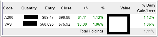
SPOILER
From the snapshot above, you can see that both A200 and VAS ETF in my portfolio are up 11.7% and 10.5%, respectively.
I started buying shares in the market during May 2020, and that was when the first uptrend region appeared after the crash.

Get the Source Code
You can download the above source code from GitHub repository trendet.
What To Do Next
You can further extend the trendet sample code in several meaningful ways:
- Identify custom trends of investpy DataFrame.
- Identify trends of custom DataFrame.
- Reading the trendet’s documentation.
Python, R and Metatrader for Happi Traders
FREE $100 CREDIT
BUY A COFFEE
BE A HAPPI PATREON
REACH OUT
Dev.to: https://dev.to/dennislwm
GitHub: https://github.com/dennislwm
Twitter: https://twitter.com/leetradetitan
YouTube: https://youtube.com/leetradetitan